Image annotations are text and shapes in screen captures or diagrams that help to reference information and focus attention on the most important aspects of the screenshot. We recommend that you use them cautiously because sometimes they can be a distraction and are also difficult to keep up to date. Keep in mind that you can use alternatives such as image captions or instructions right in the text.
If you need to use image annotations:
- Be concise.
- Make sure annotations are easy to distinguish from UI text. For example, you may need to offset your boxes so they don't look like UI elements.
- Annotations aren't translated, so use them sparingly.
- Don't use an annotation at the top that acts like a title. Use a caption.
- Esnure that annotations are visible in dark and light mode.
- Use our New Relic SnagIt theme (link only available to New Relic employees) to keep your annotations consistent.
Install the New Relic SnagIt theme
Follow these steps:
Ensure you're running the latest version of SnagIt.
In GitHub Desktop, clone the repo locally.
Open SnagIt and select any tool to open the right nav.
Under the Quick Styles pane in the right nav, select the gear icon in the Theme field, and then Import.
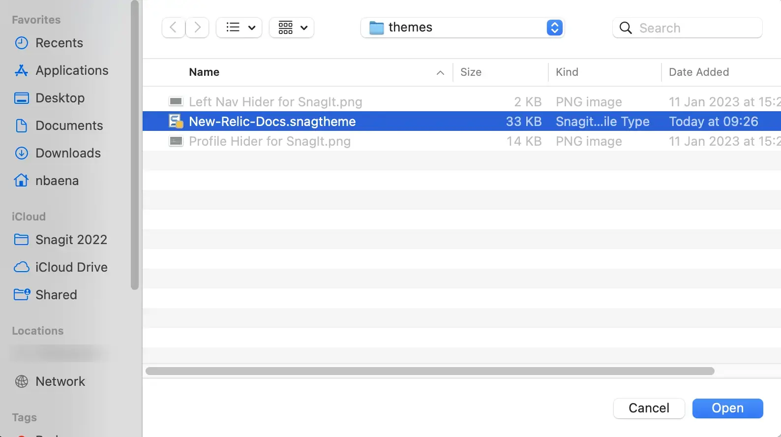
In the dialog box that opens, go to
YOUR_GIT_DIRECTORY/newrelic-doc-tools/themes, select theNew-Relic-Docs.snagthemefile, and click Open.
Selecting the
New-Relic-Docs.snagthemefile.The imported theme is already selected in the theme field.
Callout boxes
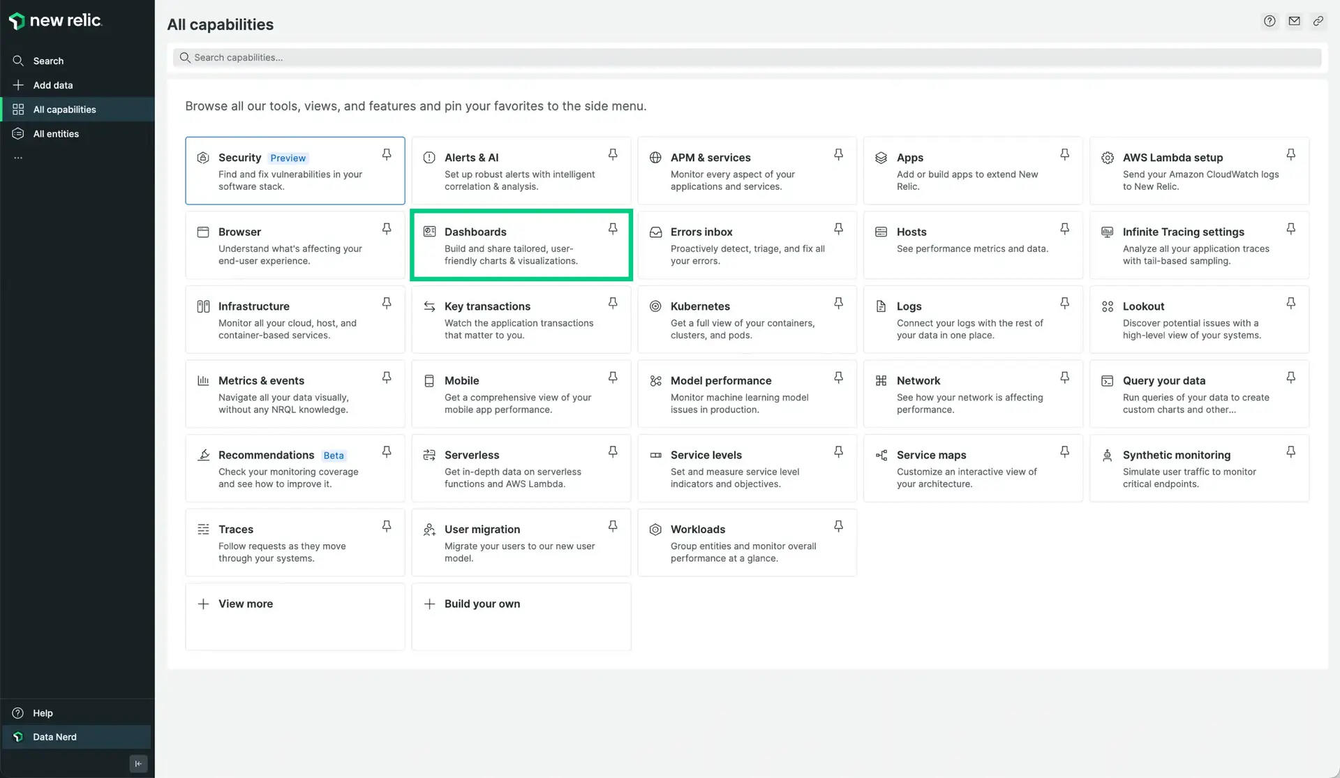
Use callouts to highlight an element within a screenshot. If possible, don't add text to screenshots, that's what our docs are for. Callout boxes should not obstruct any of the elements they're calling out. For example, a callout box around a UI button shouldn't cover any part of the button. If possible, insert a two-pixel clearance between the UI element and the callout box.
This is the format for adding callout boxes:
- Shape: square or rectangle, transparent fill, no border-radius.
- Border color: #00CE7C
- Line width: 5pt
- Opacity: 100%
- Line style: solid
- No shadows

This is an example of a callout box.
Callout text
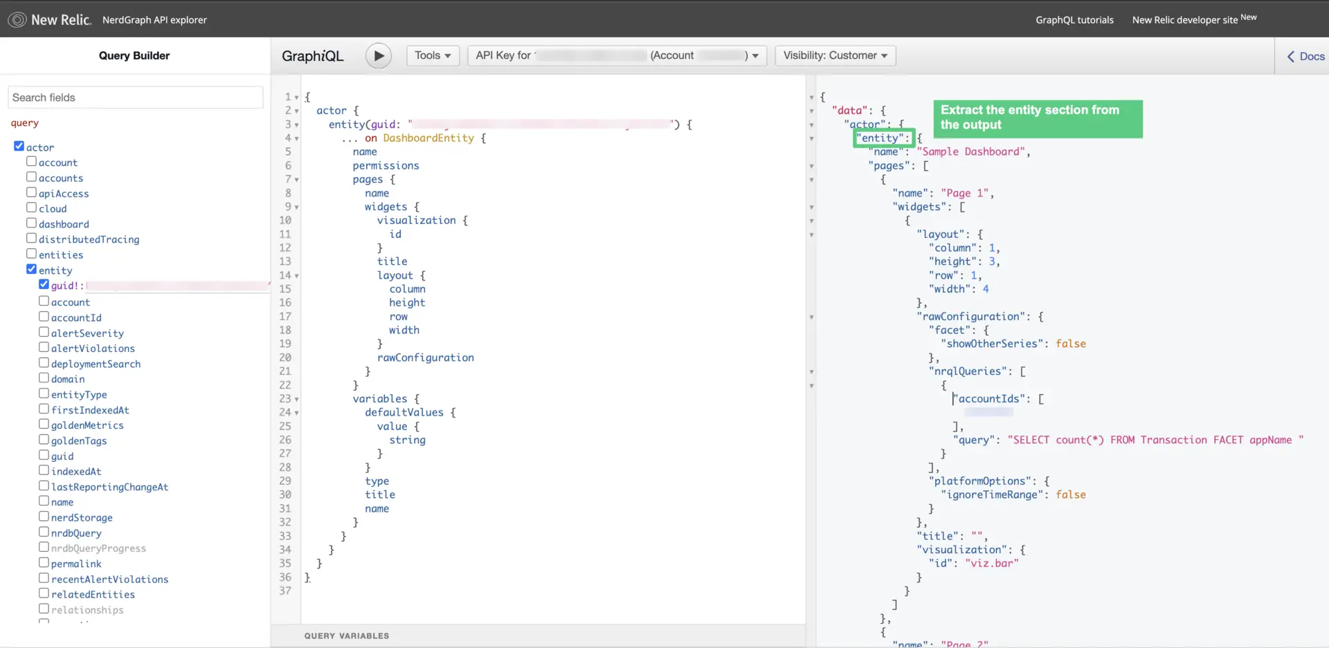
Screenshots shouldn't require a text callout 99 percent of the time; <figcaption> tags and written content before or after the image should be sufficient to explain the screenshot. However, if a text box is required, it shouldn't overlap any essential UI text or elements.
If you need to add text to a screenshot, follow these guidelines:
- Shape: square or rectangle, fill color #00CE7C.
- Border color: #00CE7C
- Line width: 5pt
- Opacity: 100%
- Line style: solid
- No shadows
- Font: Arial bold #FFFFFF, size 24pt, left justified

An example of a callout with text.
Arrows
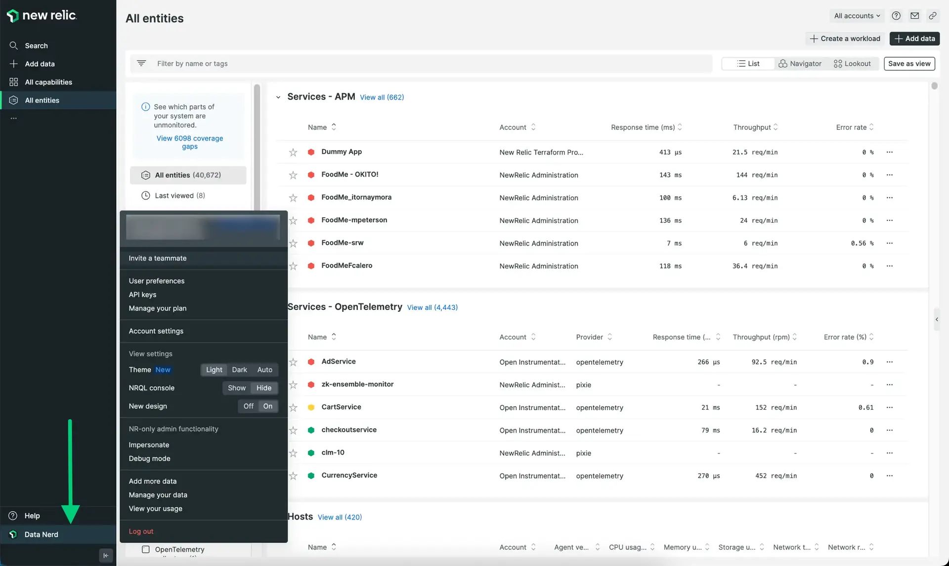
Use a single-headed arrow or an arrow with arrowheads on each end in your screenshot when you want to reference elements within the UI.
If you use an arrow, try to not overlap any essential UI text or elements.
This is the format for adding an arrow:
- Opacity: 100%
- Line width: 7pt
- Color: #00CE7C
- Line style: solid, no start size, end size to 5
- No shadows

This is an example of an arrow.