This is the third part of our implementation guide.
In the last implementation stage, you've brought in data from a few sources and you've likely explored the New Relic UI a little bit. To get optimal value from New Relic, it will help to have a strong understanding of how your New Relic data is organized, and how it's displayed on our platform.
In this stage, you'll:
- View some UI experiences that give you an overview of your system performance
- Learn to create custom charts and dashboards
- Think more about how to organize your data with tagging and workloads
Let's get started.
Get high-level views of your system and entities

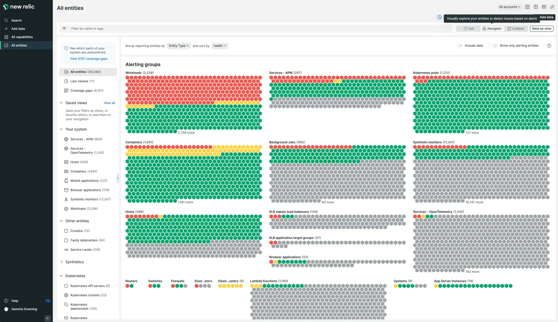
New Relic Navigator is one of our platform experiences that help you quickly understand the state of your system.
Our platform makes it easy to get a high-level view of your system and all your entities. Here are some important features your team will probably use a lot. We recommend you spend some time exploring these and other UI experiences to get comfortable with the New Relic UI.
- Use our entity explorer to browse your monitored entities.
- Use New Relic Navigator to see a visualization of your entire system, with an emphasis on health/alerting status.
- Use distributed tracing to see detailed time-based analysis of the requests that occur in your system. Recommended: set up Infinite Tracing to unlock more powerful tracing features.
- Use service maps or automap views to see visual representations of your topology.
- Use the Dependencies UI page for a specific service to understand the inbound and outbound services an entity connects to.
Want to see a video with a tour of the platform? See Get to know the platform.
Organize your data
Organizing your data in New Relic is important, because it helps you more quickly cut through the noise and diagnose problems. Here are some tips for ensuring your data is well organized in New Relic.
Set up custom dashboards
We provide many curated views and dashboards out of the box, but you'll likely need to create your own custom dashboards to keep an eye on business-relevant metrics or specific projects. You can share dashboards with other team members to track performance and troubleshoot issues.
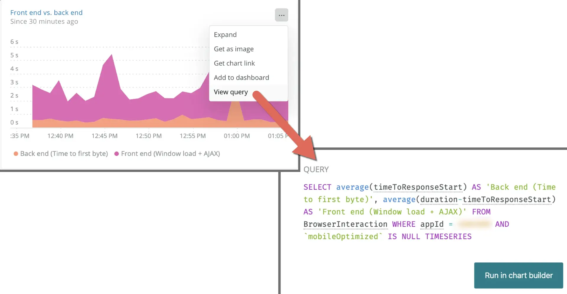
Creating custom charts and dashboards begins with querying your data. Our query language, NRQL, is a SQL-like language that gives you all the power that we use to build our curated views.

Our query builder helps you query your data and create custom charts.
Our customers who get the most out of New Relic have a strong understanding of how to query, which gives them the ability to build useful charts and dashboards. You don't have to learn NRQL in-depth now but learning some basics can be helpful.
Here's a short 2-minute video about starting to query:
When you're ready, we suggest building a dashboard. When you run a query, you can hit Add to dashboard at the bottom of the screen, and then you have an option to create a new dashboard.
Here are some resources for learning how to create custom queries and visualizations:
Set up tags
We talked a little bit about tagging strategies earlier in the implementation guide. Tags are key-value pairs that can be added to an entity. Some tags are added automatically to your data: for example, the host name, the account name, and some other basic metadata. But to get the most out of New Relic, you'll want to add custom tags.
With a well thought-out and consistently implemented tagging strategy in place, your team will more easily be able to explore your data and find the entities related to an issue. Tags are important for the optimal use of workloads, querying, and other features.
Tags can vary greatly, depending on your architecture and your goals. But here are some examples of commonly used tags:
- BusinessUnit
- Environment
- Team
- BusinessCritical
- Region
Some resources for setting up and optimizing tags:
- Learn about tagging in New Relic
- A 22 minute video on tagging resources for faster analysis
- A 3-minute video on APM tags
- A tag improver app
Some resources for automating tags:
Set up workloads
Our workloads feature gives you the ability to group and monitor entities based on your own criteria (for example, a specific team, or a set of responsibilities). Then you can see aggregated health and activity data for that workload from across your entire stack.
Learn how to set up a workload. Here's a video on using tags to create dynamically generated workloads.
Set up Apdex for APM
Apdex is an industry standard to measure user satisfaction. It's essentially a simplified service level agreement (SLA) solution that helps you see how satisfied users are with your app. If your system uses many microservices (services that perform a single business function), Apdex is a great choice.
We recommend you read our Apdex docs to understand how Apdex works. Then, if you'd like to set it up, try to figure out what the correct Apdex thresholds should be and set them. If you don't know the right value, you can set the threshold to a minimum now, and later on adjust it to a better value.
Some resources for setting up Apdex:
- A blog post on setting an optimal Apdex
- A New Relic app for optimizing Apdex
- Automation tip: You can use our NerdGraph API to query your data and determine the right Apdex T, and then set the Apdex via API.
Service level management (SLM)
Service levels are used to measure the performance of a service from the end user point of view. For instance, a service level can represent whether a video loaded quickly enough, or whether a directions service returned at least one possible route between two points.

A screenshot from our SLM UI (click to enlarge).
Some resources for learning more about SLM:
Observability-as-code resources:
Next stage
Ready to continue on your implementation journey? Go to the next stage: Alerting and proactive solutions.