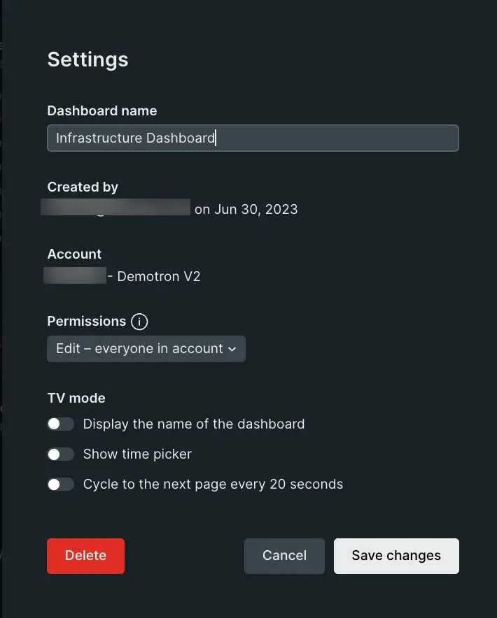
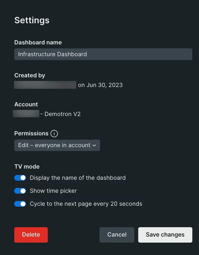
Access any of your New Relic dashboards to create or manage your charts directly from the chart menu, customize your dashboard's layout, adjust display modes, or export your data.
Once you've customized your dashboard and built your charts, use our advanced visualization features and tools for data exploration to correlate and analyze your data.
Customize your dashboard
Go to one.newrelic.com > All capabilities > Dashboards to open the dashboards page.
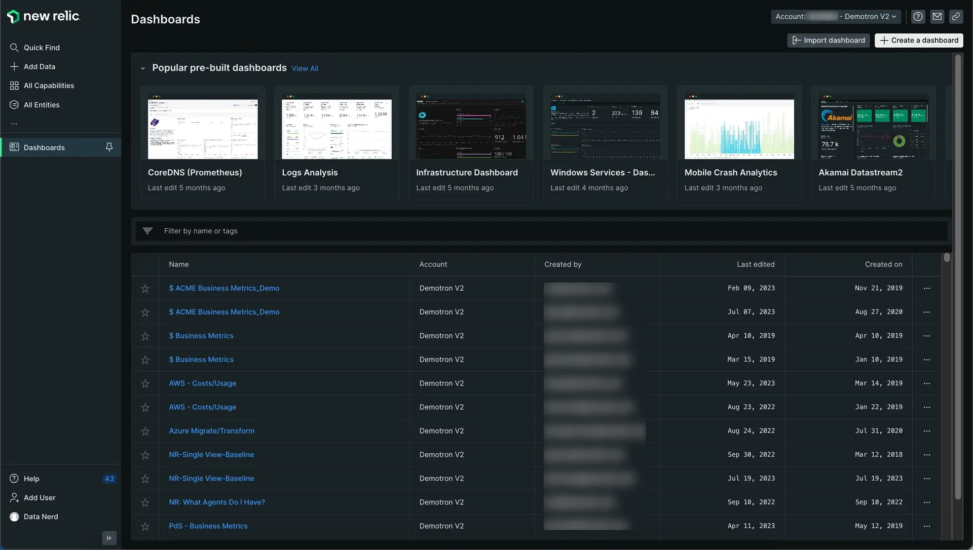
Go to one.newrelic.com > All capabilities > Dashboards to open the Dashboard index.
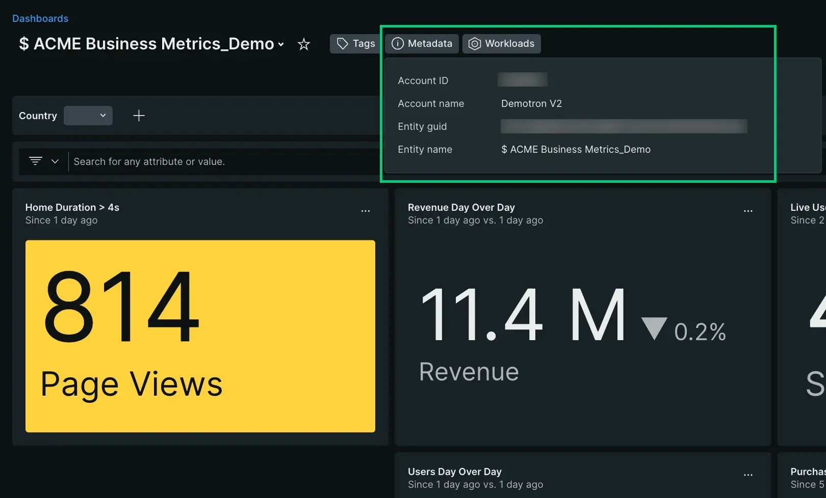
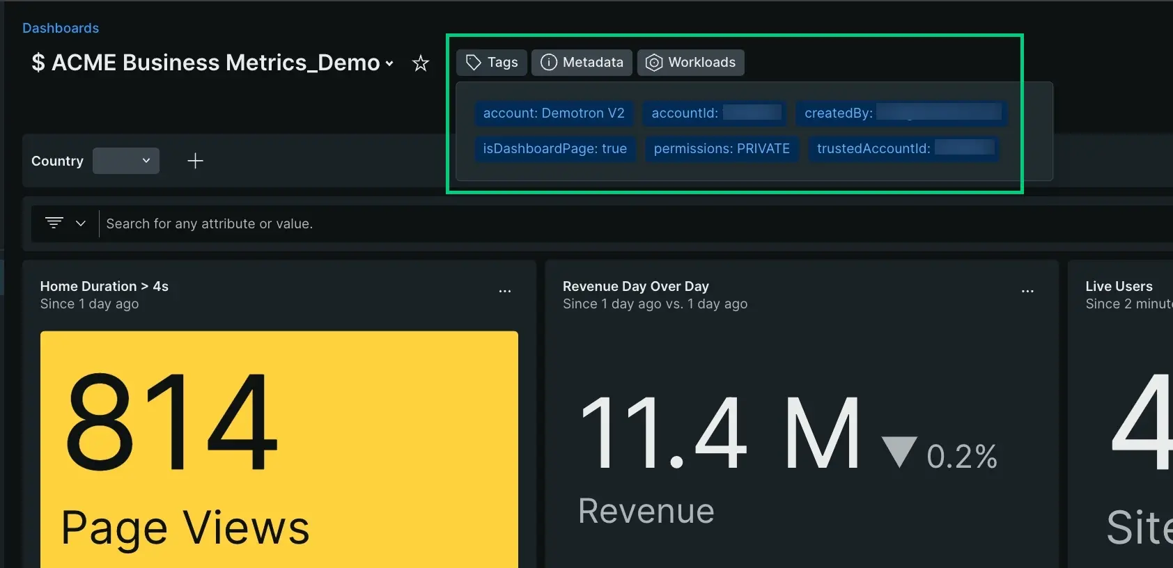
Click a dashboard to open its charts. A dashboard page includes these features:
Manage dashboards via API
For how to create and manage dashboards via API, see NerdGraph: Configure dashboards.
Add new content to your dashboard
Here's a few ways to add new content to your dashboard:
- Click the edit button at the top right corner, then create new content by clicking the Add widget button.
- From metrics and events and query builder.
- Use the + Add widget button (accessible from the main dashboard page or in the edit mode) to access the query builder, or to add content (such as text, links, or images) using our Markdown editor.
- Copy an existing chart from any dashboard.
If you experience issues adding new content, check our error messages.
ヒント
After adding a widget, you can customize it by adding a clickable link to the widget title or a tooltip description. For customization options, see Widget links and descriptions.
Add custom content using the Markdown editor
Add context and flair to your dashboard with custom content using our Markdown editor. With this feature, you can add formatted text, checklists, images, code snippets, and more. This makes it easy to explain shared dashboards, add useful hyperlinks, create task lists, and create any other rich content you need.
The Markdown editor contains a Markdown pane, where you enter your content, and a Preview pane, where you can view it. For more information about Markdown syntax options, see the GitHub's Markdown guide.
You can also edit existing content by clicking the ellipses icon on any Markdown widget and selecting Edit.
The Markdown widget supports Mermaid diagrams. For more information, refer to Mermaid syntax reference.
Learn more about what you can do with the Markdown widget in the short video below (approx. 3:11 minutes):
Organize your dashboards with pages
You can use multiple pages to organize your dashboard data in different views. When you add more pages to that dashboard, you can access these pages using the tabs at the top of the dashboard UI.
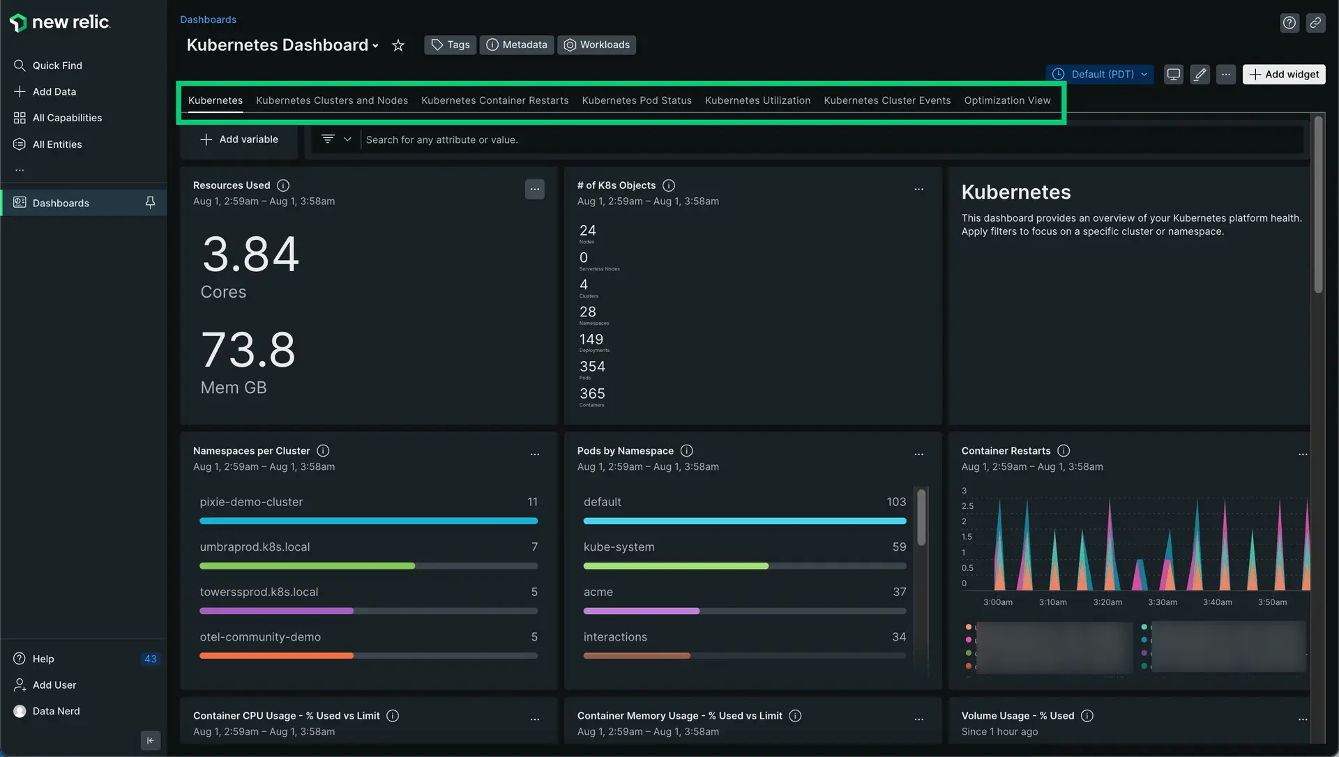
one.newrelic.com > All capabilities > Dashboards: This is an example of a dashboard with multiple pages, represented by the tabs at the top of the dashboard. You can add pages to dashboards, copy existing pages, and drag and drop the page tabs to new positions.
You can use this feature to group together related dashboard views. This is valuable when you're aggregating a lot of data and charts related to a specific project, team, or subject.
For example, a mobile app team might build a dashboard focused on app performance by country. The first dashboard page might be an overview of performance across all countries, with other pages focused on specific countries.
There's other features to connect dashboards:
- Create widgets containing Markdown text to add direct links to specific UI pages or dashboards.
- Use facet filtering to create links that automatically link to and filter other dashboards.
- Use the dashboard search to find similarly named dashboards. To take advantage of this, you can add team- or project-specific words/phrases to dashboard names.
Add and edit pages to a dashboard
To add or edit a page in a dashboard:
- From a new or existing dashboard, enter edit mode by selecting the icon. Depending on the permissions of the dashboard, you'll see this icon or not.
- Add a new page:
- Select Add a page to add a blank page.
- Clone an existing page by clicking the dropdown next to a page name, and selecting Duplicate Page.
- While in edit mode, you can add widgets to the new page, drag and drop page tabs to new locations, and do other dashboard editing tasks.
- When you finish, select Done editing.
Manage your charts and Markdown content
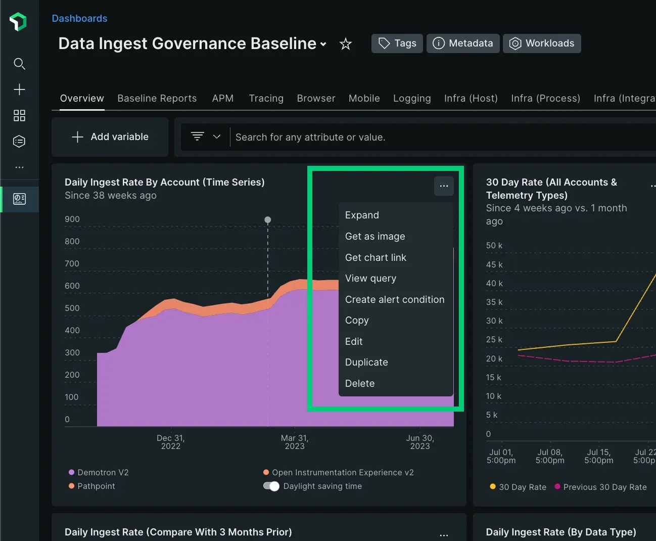
From any Markdown element, access the menu on the upper right corner to edit or delete it. From any chart, access the chart action menu on the upper right corner to:
- Expand your chart to full screen.
- Share your chart as an image or with a link.
- For table charts only, export as a
.csvfile. You can import this file into other apps like Microsoft Excel or Google Sheets to do further analysis. - View the query.
- Copy the chart to any dashboard.
- Open the NRQL console to see or edit the query associated to the chart.
- Duplicate the chart.
- Delete the chart.
重要
You can't edit the query of a chart if you have Read only permissions to the dashboard.
Learn more about how to use your charts.
Filter and refine your charts
You can narrow down the information on display using the filtering function, which is a visual representation of query conditions:
- Use the filter bar to select the values or attributes you want to see, and remove the rest of the elements from the charts.
- Open the advanced filter bar to access the boolean operators (such as
=,!=,CONTAINS,EXCLUDES, etc.) and add compound and complex conditions for filtering data.
After applying a filter, your dashboard will only show the data associated to the elements you selected. A small counter indicates the number of filters applied at a time.
To return to the default view, click on the small cross by the filter to remove it.
Filter using the chart legend
Click on a legend in any chart with legends to see that series only, and remove the rest of series from the chart. This helps you isolate the data you want to analyze.
To do the opposite, use CMD (in a Mac) or CTRL (in Windows): This will remove the selected series, and keep the rest.
Filter dashboards using facets
If a chart's NRQL query contains a FACET clause, you can use the faceted attributes to filter the current dashboard or another related dashboard. For more details, see Filter by facets.
Use the time picker to adjust time settings
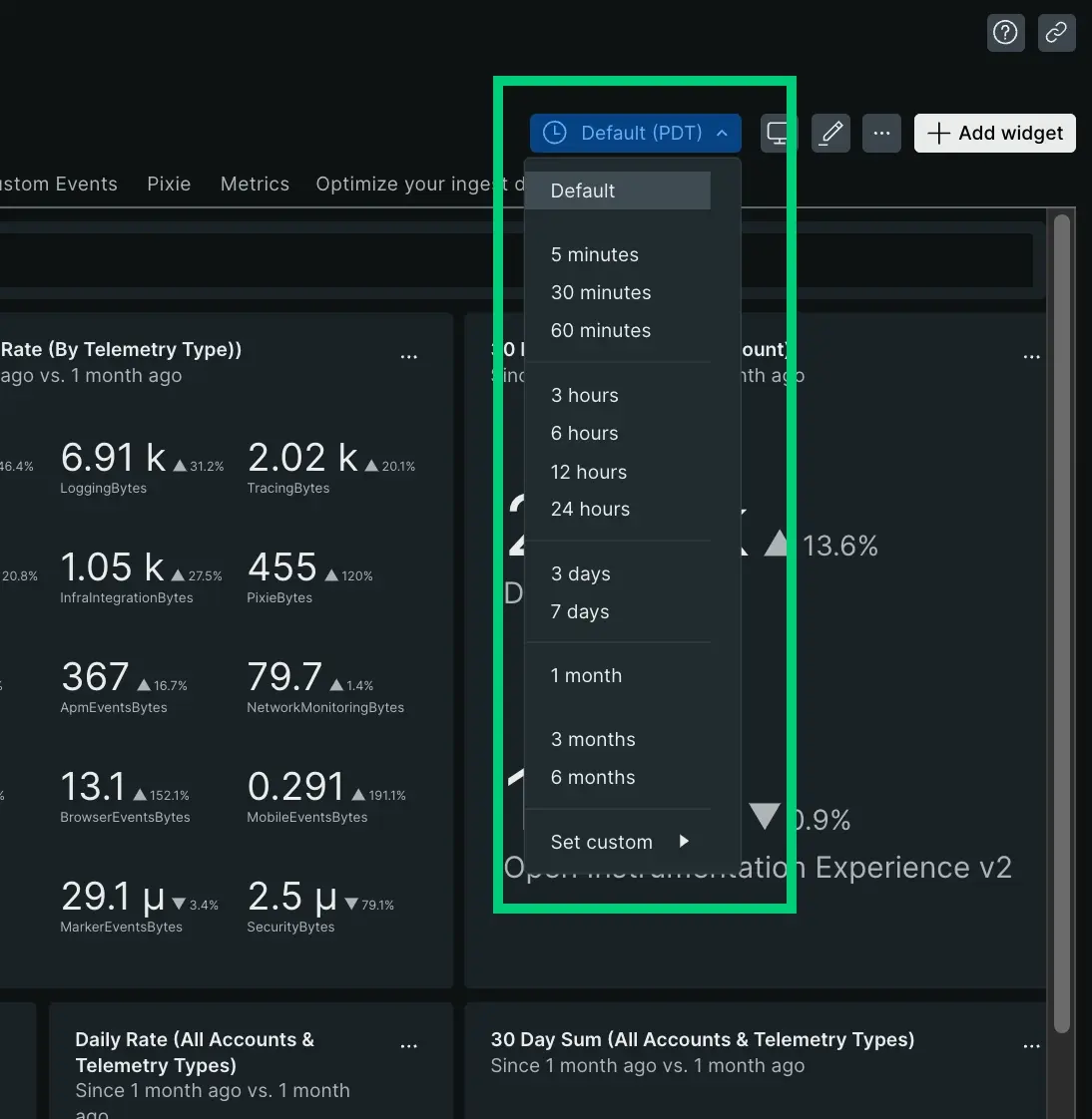
By default, each chart in the dashboard show data for the time period specified when they were created in the query builder. However, you can use the time picker to change the time range of the data on display and set the same range for all charts. This is particularly useful while troubleshooting alert events, if you need to narrow down your data to observe what happened in a specific time period.
The refresh rate depends on the duration of the time window you are viewing. For more information and examples, see Chart refresh intervals.
To change the time range:
- Select one of the available options from the dropdown menu (ranging from last
5 minutesto last6 months). - Customize the time range with specific start and end timestamps using the custom menu.
If you don't want to change the time range of a chart when using the time picker:
- Click the icon and select Edit.
- Open the Dashboard Options menu in the customizations UI.
- Set the Ignore time picker toggle to on or off depending on your need.
Export your data
You can export your dashboard and chart data with either of the following options:
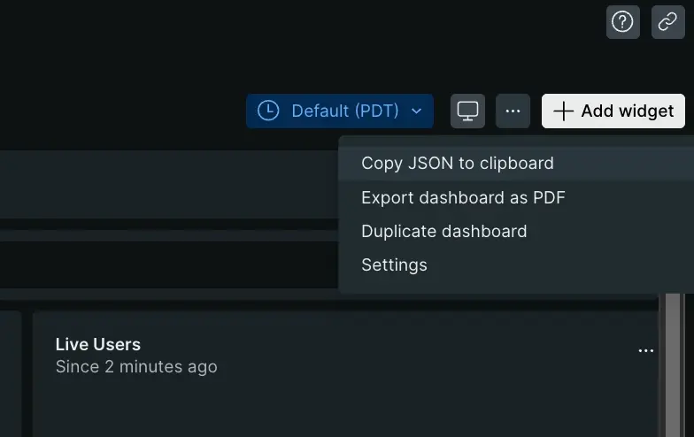
- Export any dashboard as a PDF file clicking the icon on the right corner and select Export dashboard as PDF.
- Share your charts either as a PNG image or as a link: Click the icon on the right corner of the chart and select the Get as image.
Exporting to PDF or as an image has certain limitations depending on the chart type. Please note that both the PDF and PNG image generated links are publicly accessible and do not require any login.
Recover deleted dashboard
If you delete your dashboard, you can quickly restore it with NerdGraph. To learn how, read the Support forum post, or watch this short video (2:14 minutes).
Key visual tools
Dashboards offer intuitive visualization features and tools for advanced data exploration and fast troubleshooting.
