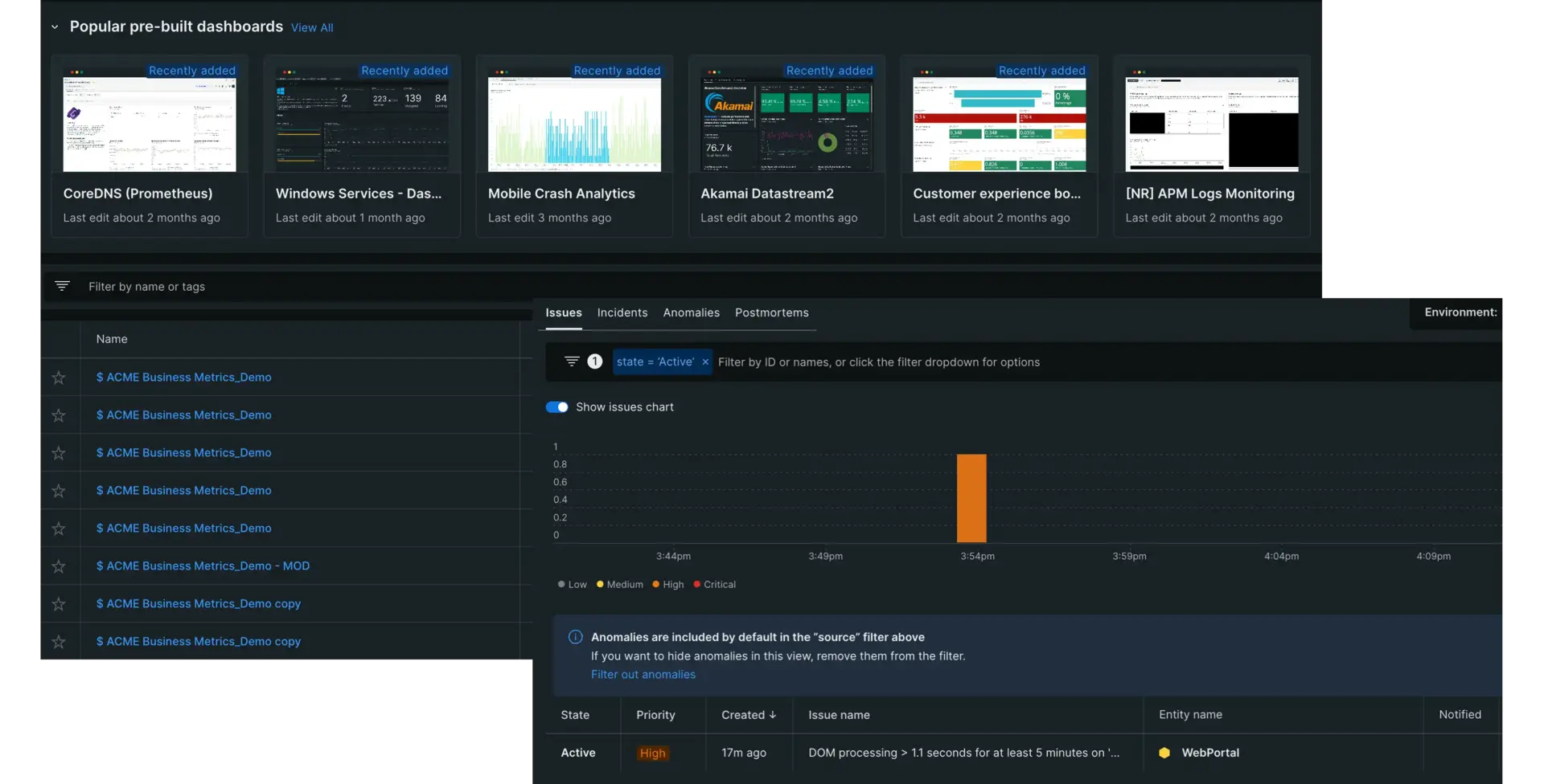
Setting up monitors for your data is the foundation of observability, but it's only half of the equation. You need to be able to visualize your data, group streams together, and be notified when your system runs into issues that negatively affect your users. You need to be able to do all this from a centralized location, and be able to adapt to the changing data needs of your organization by curating new visualizations on-the-fly.
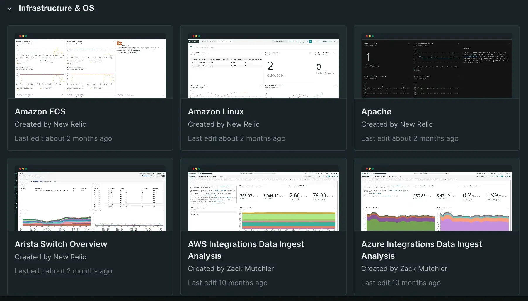
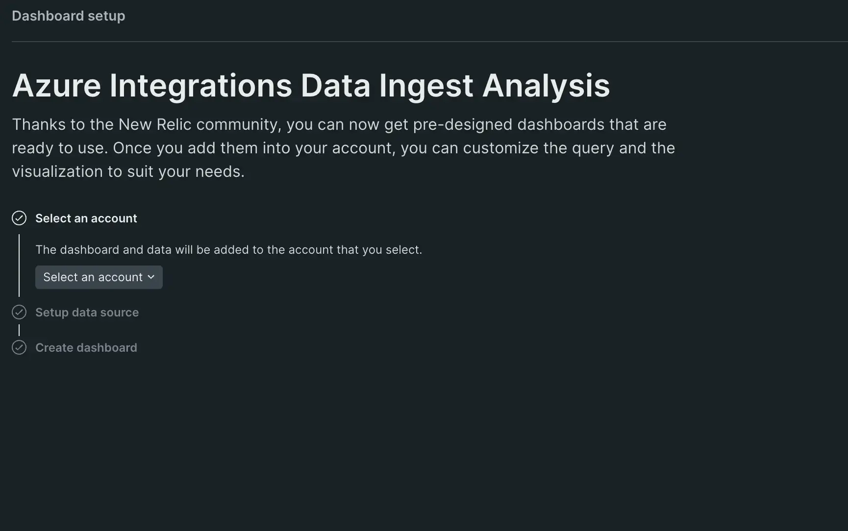
Where New Relic entities can give you scores of data to observe, our dashboards and come in to help you make the most of it. You can use our pre-configured options to set up dashboard solutions out of the box, or use NRQL, New Relic's Query Language, to create custom dashboard components and alert policies that are as fine-tuned to your requirements as you need want them to be. And like all our other features, you can try out dashboards and alerts using your own data for free.

Visualize from the get go
As soon as you begin ingesting data, New Relic automatically begins providing you visualizations to help monitor it without any further setup. The dashboards and charts we generate for you give out-of-the-box, granular details on what you've chosen to monitor. For example, once you finish setting up an APM, you'll immediately have access to:
- A chart for tracking web transaction times, available to view in multiple formats.
- An Apdex chart for tracking your Apdex score over an adjustable period of time.
- Charts for tracking throughput, errors, and logs.
- Distributed tracing insights that show information on exclusive duration, call counts, and more.
- Sections detailing the total number of issues and vulnerabilities, as well as the percentage change in error rate and response time since your last deployment.
- Recommendations for improving your stack and where to go after you've set up the data ingest.
The above examples are only one set of visualizations you get without needing any setup time. Features may change depending what data you're ingesting and what capabilities you've set up within the platform. Regardless of what you choose, we'll be sure to give you an array of information on the data you observe within our platform without you having to do anything at all beyond the setup procedure.
Your dashboarding solution
Our dashboards take the data you put into New Relic and provide you with a wide array of visualizations to suit your needs. You can make them as wide-viewed or as detailed as you like, and use them to troubleshoot issues before they become problems. Our dashboards give you:
- Analysis into your system, letting you correlate issues and act on them fast
- In-depth views of your network, infrastructure, applications, logs, and anything else you need
- Eliminate data silos and view your entire stack at a glance
- Report on custom information from virtually any data source
Your alerting solution
Being able to see your data is great, but being able to act on it to correct or prevent errors is even better! New Relic gives you multiple ways to customize for your unique requirements while helping to eliminate alert fatigue. We offer proactive awareness for your problems, utilizing machine learning to enhance our policies. Our alerts:
- Give you both preconfigured and from scratch creation options
- Constantly detect the anomalies you care about the most
- Notify the right people at the right time, eliminating confusion in dealing with issues
- Prioritize alert importance, reducing clutter and helping you keep track of what's really important
For more on creating alerts, see our alert conditions doc.

