Our tools can help you resolve alert events when you have limited time. With the APM summary page, you can see an overview of potential failures in your apps and get important metrics about each of your services. It's the first place you'll go to check the health of your service, understand any problems within a larger context, and take the necessary steps to resolve the issue.
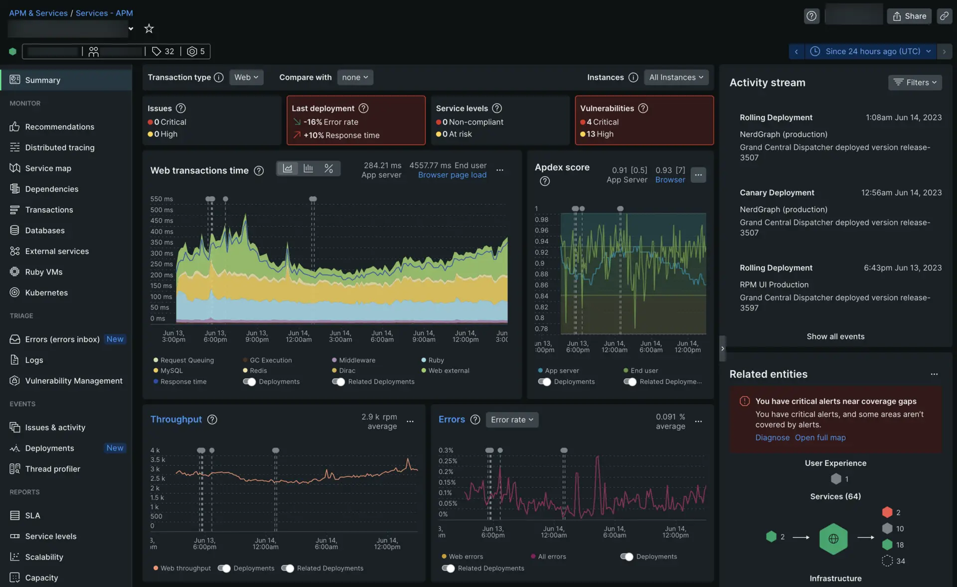
This doc walks you through a fictional example of how to use New Relic's APM tools to determine the root cause of service degradation. You're going to explore a situation where you work for a fictional e-commerce company that sells shoes. You are an engineering manager for the checkout team. Customers have been complaining they have to wait too long to check out.
After a customer puts a pair of shoes in their cart and decides it's time to check out, they will hit the Pay Now button. Checkout-service is the entity that manages the functionality of the Pay Now button.
To figure out why customers can't click the Pay Now button, open APM and select your Checkout-service.
Identify painpoints with summary tiles
Before you dive into the specifics, it's important to first look at the summary tiles at the top of the page. These tiles alert you to any issues, vulnerabilities, or deployment failures in your system immediately. If the tiles on the top of your page show an empty state, click Set up now to activate each tile.

Issues
An important way to track unusual behavior in your system is through alerts. Let's say you want to know when the transaction error rate for Checkout-service exceeds 10%. You'd create an alert condition and set the rules that will trigger an alert event. One or more alert events creates an issue. This tile will display any issues in your service.
In this example, you've already set up your alert conditions so when you scan your summary tiles you immediately see that your system has two critical issues. Click the tile to view details about each critical issue, the alert events they contain, and their related entities.

Last deployment
Deployment markers help you monitor the results of every update you make to your service. This tile shows the change in error rate and response time triggered by your last deployment.
Starting 15 minutes after a deployment, this tile will display a comparison between data collected before the deployment and after. If you enabled a new feature 45 minutes ago, this tile will show a comparison between the 45 minutes before and 45 minutes after. For the first three hours after a deployment, this tile will only display a comparison of time passed since enablement matched with the corresponding time before enablement. After three hours, the tile uses the standard 3-hour comparison.
For a custom time range, click on the tile to go to the main deployments page and use the time picker there
For this example, your last deployment triggered a 27% spike in error rate and a 5% increase in response time. Click the tile to view your last deployment and any related errors, logs, alerts, and trends.

Service levels
Service levels are used to measure the performance of a service from the end user's point of view. When a service level's error budget is exceeded, you'll see these alert event types:
Non-compliant means you've consumed all of the error budget for this period. So be careful if you need to deploy, and plan some work to improve your SLs.
At risk means your error budget is nearly consumed, and you should be more cautious for the rest of the period.
For this example, you have already configured your service levels and you have exceeded your error budget in two instances. Click the tile to see which entities are non-compliant and dig deeper into your error budget.

Vulnerabilities
Vulnerability Management provides a birds-eye view of all your software's vulnerabilities. Each of your integrated agents or services, like Java, .Net or Github Dependabot will automatically funnel known vulnerabilities to New Relic to track.
Here you can see that you've enabled Vulnerability Management and have 3
Criticaland 9Highvulnerabilities detected for your monitored service. Click the tile to view your vulnerability impact.
Review your key metrics
Is there a problem with your Checkout-service? Which systems are affected and how?
Apdex
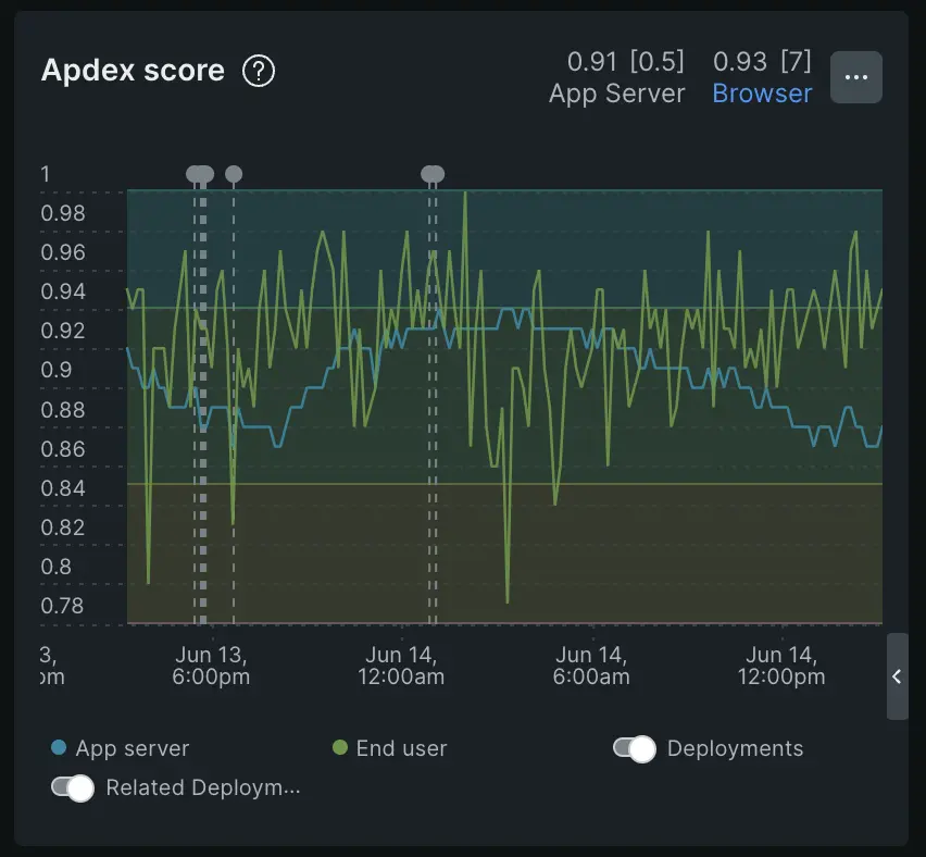
The first place to look when investigating a breakdown in service is your Apdex score. Your Apdex score monitors overall customer satisfaction with your application. Your score looks for a combination of performance, like response time or throughput, and error rates.
Apdex is an industry standard that measures your users' satisfaction with the response time of your web application/service. It's represented as a score from 0-1. The closer your score is to 1, the better your app is performing. The default value for a satisfactory experience is 0.5 seconds, but you can set a different target under Settings.
Your Apdex score is typically divided in the following colors:
< 0.5 - Gray: Your application's performance is beyond critical and needs immediate action.
0.5-0.7 - Red: There are critical performance issues in your application and it needs immediate action.
0.7-0.85 -Orange: Your application is trending in a negative direction and needs further investigation.
0.85-0.95 - Blue: This is the ideal Apdex range. This score means that you have fine-tuned your Your Apdex T perfectly for your application and your performance is healthy.
> 0.95 - Blue: If your Apdex score is in this range, it means that means that your Apdex T might be set a little too high and you're not getting an accurate read on your application's performance.. You should consider reducing your Apdex T.
팁
If you have an Apdex score of 0, it could be because a request returned with an error. Every request with an error automatically scores a 0 on Apdex.
For this example, after opening your
Checkout-serviceentity in APM, you see that your Apdex score has fallen and is hovering at 0.6. The chart is red.You now know for certain that your customers' complaints are correct: there is a problem somewhere in your stack.
For more about how to understand your score, see Apdex: measure user satisfaction.
Web transactions
Based on customer reports you know that the
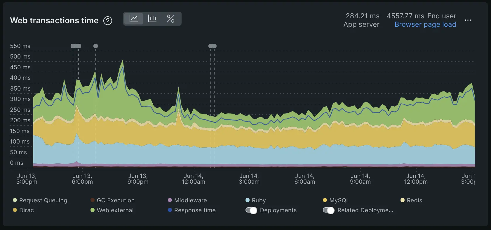
Pay nowbutton is failing in your app but you're unsure of what's causing the actual error. You've checked Apdex and it's showing poor user satisfaction.The next step is to figure out which part of the checkout process is breaking by investigating your app's Web-transactions.
At New Relic, a transaction is defined as one logical unit of work in a software application. Specifically, it refers to the function calls and method calls that make up that unit of work. For APM, it will often refer to a web transaction, which represents activity that happens from when the application receives a web request to when the response is sent.
Web transaction time is broken up into three parts:
Blue segment: all transactions
Yellow segment: database operations
Green segment: external services
팁
If you're trying to monitor an asynchronous application then your response time - the dark blue line - could possibly be lower than the response times for each individual segment (transactions, databases, and externals). This could happen because an asynchronous application can process multiple requests at the same time. So, it is possible for a transaction to “end” while some requests are still “open”.
A slow transaction can be a strong indicator that something is behaving abnormally, so take a look at the chart and see if any areas of your service are taking longer than normal to respond. Slow transactions will look like spikes on the chart.
You can also use our deployment marker tool to check if your team released a change around the time that customers began to complain that the
Pay Nowbutton was taking a long time to load.A deployment marker shows up as a gray pin on the each chart. You can hover over the pin for overview information, or you can click the marker for a deeper look into the deployment.
Throughput
While looking at the response times for
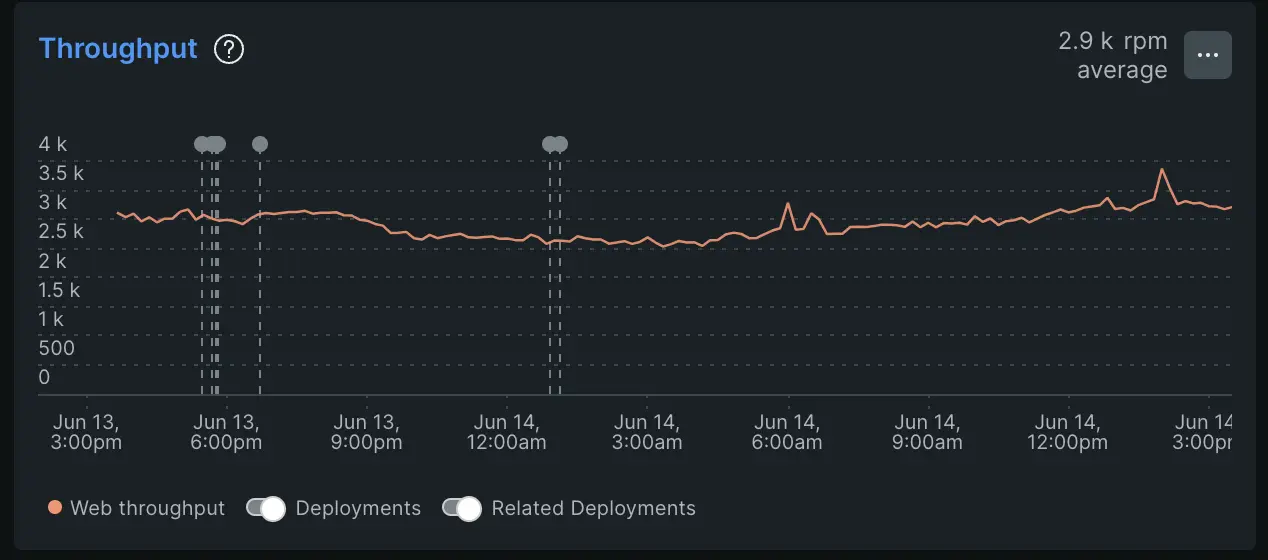
Checkout-serviceyou can also investigate throughput. Throughput is a way to measure the amount of work your application is handling. Throughput helps you understand if work is evenly distributed between your hosts and containers. Performance issues can often be a symptom of lack of resources.For the purposes of this example, you see that throughput is a little higher than usual. If your throughput is very high during a time of service degradation, it could indicate that your application is processing more work than it can handle.
On the other hand, low throughput could indicate that your app isn't handling very many requests. This could simply mean that it's not used very much or it could mean that a service that calls to your application is broken and requests aren't being processed.
Errors
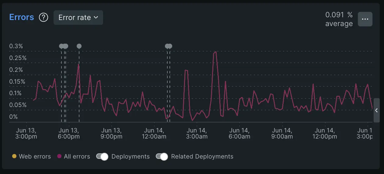
Now that you've identified slow transactions and analyzed your throughput, it's time to take a look at errors. The Errors chart shows you the percentage of transactions that resulted in an error.
In the context of APM, errors represent the
TransactionErrorandErrorTraceevents.In this case you see a spike in
Web errorsaround the same time that your web transaction response time spiked. You also see a deployment marker alerting you to a change your team made to your system.You now see a pattern surrounding this recent deployment: decrease in user satisfaction, increased response time, throughput and errors.
Use the dropdown to switch to a view of impacted users. For how to track impacted users, see Errors inbox.
For more about how to manage errors, see Manage errors
Locate the problem in a larger context
Which parts of your stack are in trouble? Was the problem caused by changes in entities that call your service, or are called by your service?
Logs
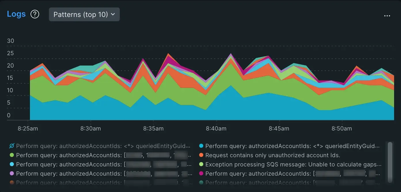
The logs chart gives you a summary view of your application's logs reported through our logs in context feature. Clicking Logs takes you to the full logs UI.
For this example, after investigating your key metrics, you know you have a problem with a recent deployment that affected Web-transaction time which resulted in a spike in errors, and low user satisfaction. Now you want to know how this affected the rest of your service.
With logs in context, your individual logs are tagged with the entity or service they're related to. On the logs chart you can select Log patterns (top 10) to display groups of logs that are identical up to the unique string identifiers.
For more about how log patterns work, see Log patterns.
Distributed tracing
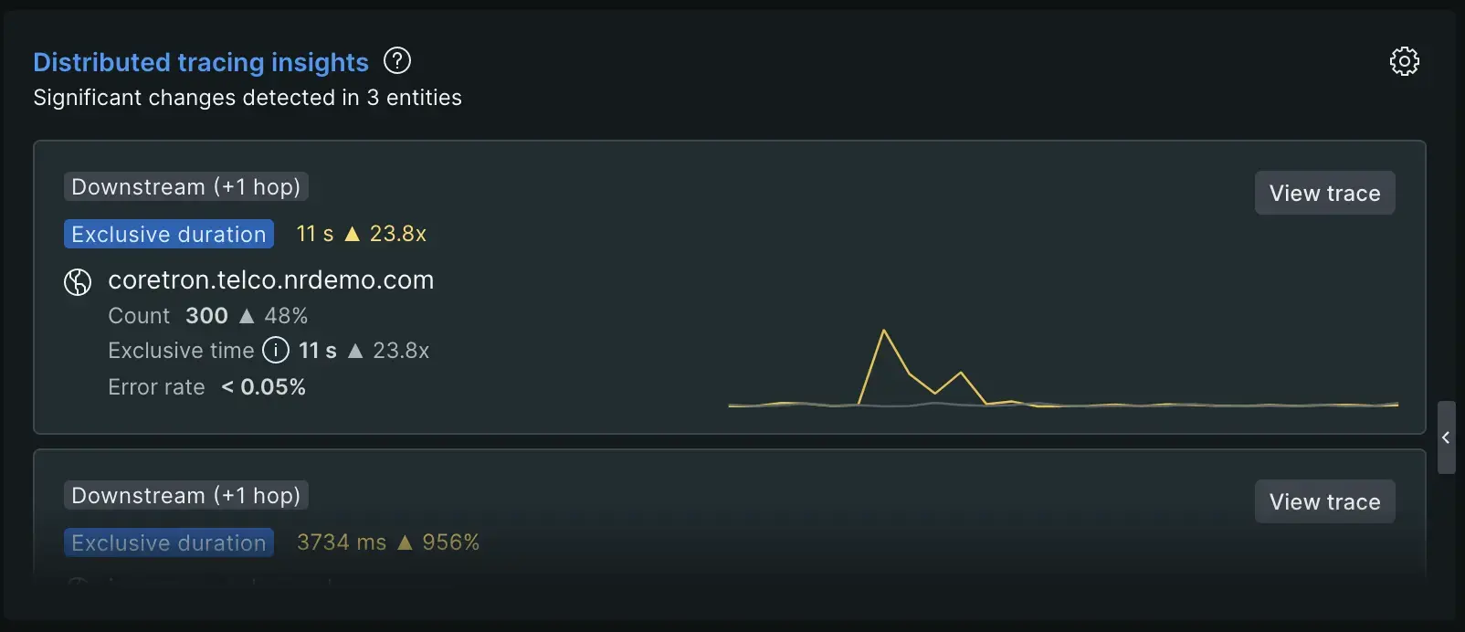
The Distributed tracing insights chart shows you upstream and downstream entities that might cause increases in response time, error rate, or throughput of your service.
For example, let's say you want to investigate an increase in response time for a service, but the spike relates to an external call. If distributed tracing recorded a downstream entity that caused latency for your service, you can view that change in performance in this list. Click the View trace button to see a distributed trace that shows performance changes.
You can learn more in our distributed tracing insights docs.
Infrastructure
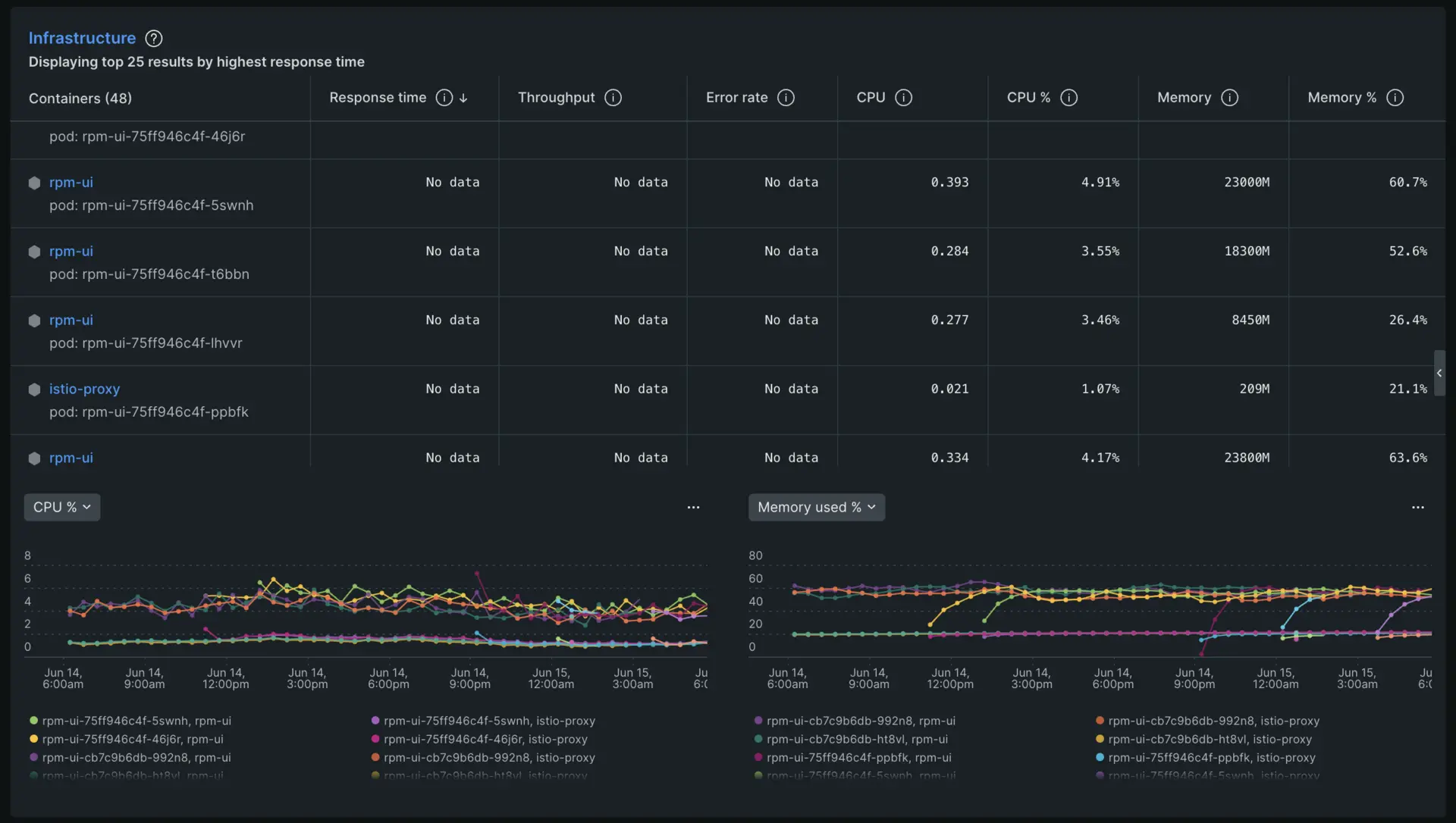
Now, scroll down to the Infrastructure section of the APM summary page. Here you'll see a table that lists each host connected to the Checkout Service application and a record of their response time, throughput, error rate, CPU percentage. and memory percentage.
For this example, we'd suggest looking to see if there were any changes to CPU percentage around the same recent deployment that caused increased response times and high error rates.
Learn more about how to investigate infrastructure data on the APM summary page here.